Reduce Redundant Links
Summary
Section titled “Summary”Redundant links occur when two or more links that appear next to each other lead to the same destination. This commonly happens when an icon or an image that acts as a link appears next to a text link. Redundant links can be confusing, often causing people to go to the same destination twice, and making navigation difficult for keyboard navigators and people using assistive technology.
Overview
Section titled “Overview”One of the more common accessibility issues with links is the presence of redundant links. Redundant links are defined as adjacent links that lead to the same location or page destination. For instance, a store website might separately link an image of a product and the adjacent text about the product to the same product page.
Redundant links may visually appear to be a single link, but keyboard navigators and assistive technology users encounter them as separate links. Eliminating redundant links is vital to ensuring accessibility for keyboard navigators and people using assistive technology so that they are able to easily navigate and interact with a site.
Examples of redundant links:
- Adjacent text links that lead to the same destination.
- Adjacent image and text links that lead to the same destination.
Adjacent links should be combined into a single link whenever possible. If one of the links is an image, the text and image links should be combined into a single link and the image should usually be treated as decorative.
People can also be confused by having the same link repeated multiple times on a web page even when the links are not adjacent. Sometimes it’s not clear to users why they are hearing the same link again. Links should only be repeated when doing so enhances the user’s understanding of the content or functionality of the web page.
Who is Helped
Section titled “Who is Helped”Screen Reader Users
Section titled “Screen Reader Users”People who are blind and people with limited or low vision who rely on assistive technologies such as screen readers to access online information can be negatively impacted by redundant links. Navigating to links is often achieved by tabbing from one link to another as the screen reader announces each accessed link.
Hearing the same link multiple times on a page will lead to confusion and inefficiency. People will be unsure about whether the links are the same or different and will be required to remember whether it’s a visited or unvisited link. This is also true when images are used as links next to text that links to the same destination. To prevent redundancy, avoid duplicating links for an image and the text adjacent to the image so that the information is not announced twice.
Users with Cognitive and Learning Disabilities
Section titled “Users with Cognitive and Learning Disabilities”Redundant links increase cognitive load. Every link encountered increases the number of decisions a user has to make. They also impact a user’s attention and cause confusion. Redundant links cause the purpose of links to become unclear. This reduces the ability of users to navigate or interact with a site successfully. Moreover, users may fail to recognize that they have already visited the page rendering the link meaningless and further increasing their confusion.
Users With Physical Disabilities
Section titled “Users With Physical Disabilities”Redundant links increase the number of keystrokes required to tab to all the links on a page for people who are unable to use a mouse. This means that a user will need to interact with a link multiple times. For users with a physical disability, these extra keystrokes may slow them down, cause discomfort, and make it difficult to navigate a site.
Guidelines
Section titled “Guidelines”To create accessible links (also referred to as hyperlinks) for users with disabilities combining adjacent links that lead to the same destination helps to create a better user experience. It is also helpful to avoid repeating the same link on a web page unless doing so adds to the user’s understanding of the content.
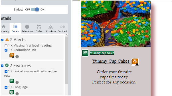
Figure 1 illustrates a situation that is often handled incorrectly. Content blocks like these, known as cards, often contain an image, heading, and text that are individually linked to the same destination. Better options will treat the image as decorative and:
- Make the entire card a single link.
- Make only the heading a link.
- Add a single descriptive link to the card’s text as in this example from Mutua11y.org.
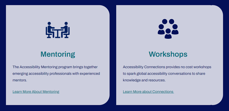
Adjacent redundant links can be frustrating for users and, in turn, inhibit accessibility and user experience. The best practice is to combine both elements in the same hyperlink.
Scenario 1: Avoid Adjacent Image and Text Links With the Same URL
Section titled “Scenario 1: Avoid Adjacent Image and Text Links With the Same URL”When an image and text are contained in the same link, ensure that the image’s alt (alternative) tag is set to a null (empty) value and that the link text describes the function or destination of the link. This ensures that redundant text is not present, as shown in the code examples below.
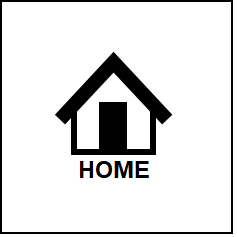
<a href="home.html"><img src="home-icon.gif" alt="">Home</a>The text and icon are contained in the same link element in the above example. Keyboard and assistive technology users will encounter the link as a single element.
<a href="home.html"><img src="home-icon.gif" alt="home"></a><a href="home.html">Home</a>In the “bad” example, the text and icon are rendered as separate links. Keyboard and assistive technology users will encounter the links as two separate elements.
This next example shows a commonly used web design pattern where blog or news articles are summarized on a landing page that has links to the articles. The article summaries often include two links - a linked image and a linked title - that go to the same article. Keyboard navigators and screen reader users will have to encounter the same link twice when this occurs. Again, combining the text and image into a single element is best to resolve this problem and treat the image as decorative.
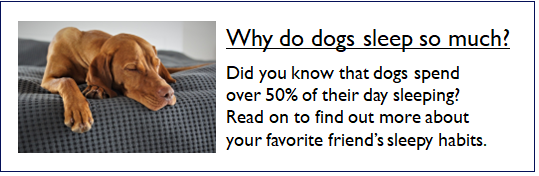
<a href="blog/sleeping-dogs.html"> <img src="sleeping-dogs.png" alt=""> Why do dogs sleep so much?</a><a href="blog/sleeping-dogs.html"> <img src="sleeping-dogs.png" alt="Why do dogs sleep so much?"></a><a href="blog/sleeping-dogs.html"> Why do dogs sleep so much?</a>Avoid alt texts that are similar to link texts: In some cases, alt text must be provided for the image, such as when the web page’s text refers to the image. In this scenario, the alt text should match the text used on the web page. This practice enables screen reader users to easily find a particular link that is referenced in the text. Both the text on the web page and the alt text should be representative of the link’s purpose, not a description of the image itself. This is shown in the sample code below.
<p>Click the help icon if you need assistance finding a product.</p><a href="help.html"><img src="images/question-mark.jpg" alt="Help icon">Site Help</a><p>Click the help icon if you need assistance finding a product.</p><a href="help.html"><img alt="question mark" src="images/question-mark.jpg">Site Help</a>Scenario 2: Avoid Adjacent Text Links With the Same URL
Section titled “Scenario 2: Avoid Adjacent Text Links With the Same URL”If a link appears near another link and both go to the same location, both elements should be wrapped up in a single anchor (link) tag, or only one link should be used.
<h2>Is My Organization Accessible?</h2><p>Ta11y can help you assess your organization's accessibility.</p><a href="assessments.html" class="button">Assess My Organization</a>In the above example, a single link is provided that clearly describes its purpose.
<h2><a href="assessments.html">Is My Organization Accessible?</a></h2><p>Ta11y can help you assess your organization's accessibility.</p><a href="assessments.html" class="button">Assess My Organization</a>In the “bad” example, the content has two nearby links with different text leading to the same destination. Keyboard and assistive technology users will encounter two separate links that have the same URL, one after the other. Along with the typical problems caused by redundant links, the difference in text used for the two links can lead people to think the links go to different destinations. This causes frustration when people find that both links go to the same destination and only one link is necessary, and individuals with cognitive disabilities can be confused when this occurs.
Scenario 3: Only Repeat Links When It Enhances Understanding
Section titled “Scenario 3: Only Repeat Links When It Enhances Understanding”There are cases where redundant links can be used to enhance people’s understanding of the content, such as:
- In scenarios where a page or content is extremely long, duplicating key links at the bottom of the page can save users time. For example, having a link to the “Contact Us” page in the site navigation at the top of a page and in the footer. An even better solution might be having a back-to-top feature at the bottom of the page.
- When supplementing links with more detailed descriptions to assist users in understanding content or choices. Ensure you pick only high-priority links to duplicate.
When links are duplicated in this way, ensure the text used in both locations is similar enough that people understand the links go to the same destination.
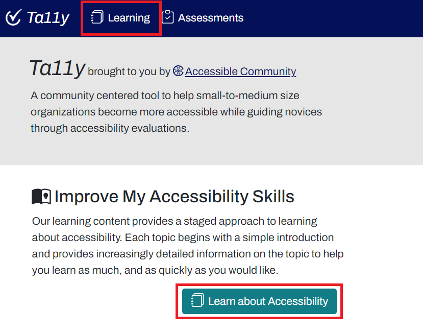
The Ta11y home page demonstrates good use of repeated links. The “Learn” link in the navigation is repeated in the page’s content, where it is supplemented with a detailed description.
Further Reading: The Same Link Twice on the Same Page: Do Duplicates Help or Hurt?
Refer to the topics below for related guidelines on creating accessible links:
How to Test
Section titled “How to Test”Two techniques can be used to find redundant links: screen reader testing or testing with an automated accessibility test tool.
Test Using a Screen Reader
Section titled “Test Using a Screen Reader”A screen reader provides a good way to test for redundant links. Repeated links are announced twice when navigating through a web page with a screen reader. Getting a list of links with a screen reader also reveals problems with redundant links.
Test Using Automated Accessibility Test Tools
Section titled “Test Using Automated Accessibility Test Tools”Automated testing entails using automated tools to assess web accessibility guidelines and performance. This includes tools such as WAVE, ANDI, Axe, and ARC that are installed as web extensions in browsers (such as Firefox, Mozilla, and Safari). These tools should be used to assist in finding accessibility issues, such as redundant hyperlinks, but should not be used in isolation.
- The WAVE accessibility test tool (browser extension) is a good choice for checking redundant links. See the WAVE browser installation for Chrome, Firefox, and Microsoft Edge and follow the instructions for installation. See WAVE for more information on using this tool.
- The presence of redundant links is identified with a “redundant link” alert, as shown in the figure 5 below.
References
Section titled “References”- Understanding Success Criterion 2.4.4: Link Purpose (In Context)
- Understanding Success Criterion 2.4.9: Link Purpose (Link Only)
- Combining adjacent image and text links for the same resource
- The Same Link Twice on the Same Page: Do Duplicate Links Help or Hurt?
- Cognitive Accessibility at W3C | Web Accessibility Initiative (WAI)
- Cognitive accessibility (MDN)
- Links | Usability & Web Accessibility
- Text of buttons and links should not be repeated in the image alternative | Axe Rules | Deque University