Charts and Graphs
Summary
Section titled “Summary”Charts and graphs add value to information. They distill large amounts of data into a story that people can see and understand. However, information-dense charts combining many colors and elements can present challenges for people with disabilities. You must ensure that data does not rely on color, has clear labels, and accurate descriptions. When charts and graphs are accessible, everyone can understand the story they tell.
Overview
Section titled “Overview”Charts and graphs can make complex data easier to see and understand. However, they are often challenging to understand, especially for people with color blindness, vision disabilities, or cognitive and learning disabilities.
Data visualization (the graphical representation of data) is a meeting point for usability and accessibility. You must clearly understand a chart’s data before you can create a usable chart that helps people understand the information.
- What story does the data tell?
- What is significant about the data?
- What is the context for the data?
- Who is going to use the data?
- How will they use the data?
- How does the chart add value to the data?
Once you can answer these questions about how the data impacts the design of the chart, consider the aspects of accessibility that impact the design of the chart:
- Is color used in ways that everyone can understand?
- Are the chart text and labels readable, meaningful, and descriptive of the data?
- Does it include text descriptions and alternative views?
- Is all essential information readily available to all who need it?
Color affects chart accessibility by requiring good color contrast and never relying on color alone to convey information. Chart text and labels provide critical information about the data that everyone can understand. Managing color and labels is far more complicated for charts than for simple imagery such as icons or buttons. Like all images, charts and graphs must be described by text alternatives so that people who cannot see them or have difficulty understanding them can still understand the information. A short alternative (alt) text is rarely sufficient for a chart; you must provide a longer description to describe these complex images fully.
Usable charts are easier for everyone to understand, but can contribute to a greater understanding for people with disabilities. Accessible charts are necessary for people with disabilities, but they can also improve everyone’s experience. You must consider both guidelines to ensure all individuals fully understand these complex images.
Who is Helped
Section titled “Who is Helped”Providing text titles, summaries, and alternative descriptions is helpful for:
- People who rely on assistive technologies like screen readers.
- People who disable images and rely on text alternatives, such as people who are neurodiverse or have low vision.
- People with cognitive and learning disabilities who may not always be able to process visual information well or quickly.
- People with low vision who can only see part of the image at a time, as the text description tells them what to look for in the image.
Providing text labels for data helps:
- People with low vision who use magnification and would otherwise need to scroll back and forth to orient themselves.
- People who have difficulty processing information can use labels to reduce the need to interpolate data.
Providing secondary information in addition to color supports:
- People who are color blind or have low vision often cannot distinguish differences between specific colors.
- People who are blind and can’t process information conveyed only by color.
Providing good color contrast helps:
- People with color blindness, low vision, or limited vision who need good color contrast to see content.
- People with difficulty processing visual content may find understanding information with good contrast easier.
Design Principles
Section titled “Design Principles”Text Alternatives for Charts
Section titled “Text Alternatives for Charts”Text alternatives for charts include several distinct information components that combine to provide a complete alternative description:
- Title
- Provides context and sets expectations for what the chart will convey.
- Overview
- Summarizes the purpose of the chart, may include trends, impacts, or conclusions.
- Values
- Describes data contained in the chart, often shown as a table view.
- Presentation
- Identifies the type of chart and how data is constructed (visual layout).
People often divide this information between the chart’s alt text and an extended text description placed directly before or after the chart. You can also locate the extended text description on another page and connect it to the chart with a link. You must include this extra information to fully explain the chart to someone who cannot see it.
Text is often included as part of the image, although this should be avoided, especially for the title and overview. Instead, you should add the title and overview as text directly before the chart. Real text is better for people who are blind, have low vision, or use magnification software.
- People who are blind hear real text through their screen reader.
- People with low vision or who enlarge their view of the screen avoid the image distortion caused by high magnification levels.
See Understanding Image Accessibility and Writing Alternative Text for information about providing alt text for images.
Six Key Accessibility Principles
Section titled “Six Key Accessibility Principles”The chart below illustrates six key accessibility principles for charts:
- Provide context and explain the chart.
- Provide alternative text and views.
- Provide clear visual labels for the data.
- Ensure good contrast to adjacent elements.
- Never rely on color alone to convey information.
- Never hide critical data.
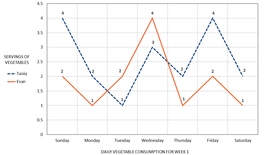
Number of Vegetables Taniq and Evan Ate This Week, by Day
This Week Taniq Ate 5 More Servings of Vegetables Than Evan
Principle 1: Provide Context and Explain The Chart
Section titled “Principle 1: Provide Context and Explain The Chart”The title and overview communicate the chart’s context and explain its story. They set clear expectations for the information conveyed by the chart.
Context determines what information and level of detail the title and overview contain. In our example, Evan and Taniq’s parents post how many vegetables their children eat each week on a Facebook page to share with friends and family. The trend is more important than the specific data in this context. If the same information were tracked for their doctor, describing every data point might be more important than the trend and might change the chart type (a bar chart might be more appropriate in that context).
Title: Number of Vegetables Taniq & Evan Ate This Week, by Day
The title tells you what question is answered by the chart. In our example, the question might be, “How many vegetables did the children eat each day this week?” The title provides context and sets people’s expectations for what the data will convey.
Overview: This Week Taniq Ate 5 More Servings of Vegetables Than Evan
The overview briefly explains the story conveyed by the data. It describes the chart’s purpose and may include trends, impacts, or conclusions. The level of detail should match the context. In our example, the overview describes the overall trend for Taniq and Evan’s vegetable consumption this week for friends and family.
If possible, both the title and the overview should be true text and visible, as this better supports people who are neurodiverse, have low vision, or rely on assistive technologies.
Principle 2: Provide Alternative Text and Views as Needed
Section titled “Principle 2: Provide Alternative Text and Views as Needed”Given the complexity of most charts, both a short alt text and a long description or alternative view are usually needed to provide equivalent information to people who cannot see the chart.
The depth of explanation required depends on both the context and the chart’s content. A more complex chart usually requires a more in-depth explanation.
If the title and overview are part of the chart, then the alt text or long description must include them. Remember that the combination of text, alt text, and long description for the chart must convey the chart’s title, overview, values, and presentation to all users.
In our example, context and purpose also matter. If this information is only shared with friends, then a short description of the chart’s construction and the trend of Taniq eating more vegetables than Evan may be all that is important. The following alt text is enough to reflect that:
Line chart with two lines showing that Taniq ate 18 servings of vegetables this week, while Evan only ate 13. Taniq ate more vegetables than Evan 5 days out of 7.
However, if we’re tracking this information to share with a doctor, we need to supply more detail - alt text will not be sufficient. In this case, the alt text should describe the chart’s construction and overall data trend, then direct readers to the body text after the chart for the full description:
Line chart with two lines showing that Taniq ate 18 servings of vegetables this week, while Evan only ate 13. See the text after the chart for a full description.
The text below the chart might be a detailed description of the chart’s layout and the number of vegetable servings eaten each day of the week by Evan and Taniq. Sometimes, this detailed description may fit naturally into the body text; other times, you may want to differentiate it from the rest of the text. Here’s an example of what a detailed chart description might look like.
This two-line line chart compares the number of vegetable servings Taniq and Evan ate every day this week.
The y-axis represents the servings of vegetables from 0.5 to 4.5 in half-serving increments. The x-axis represents the day of the week, from Sunday to Saturday.
Taniq ate 4 servings of vegetables on Sunday, 2 on Monday, 1 on Tuesday, 3 on Wednesday, 2 on Thursday, 4 on Friday, and 2 on Saturday for a total of 18 servings.
Evan ate 2 servings of vegetables on Sunday, 1 on Monday, 2 on Tuesday, 4 on Wednesday, 1 on Thursday, 2 on Friday, and 1 on Saturday for a total of 13 servings.
A text description like this can be difficult to understand, so using a table is often a better choice as an alternative view. On websites, a button often allows users to switch between chart and table views of the data. In some cases, combining the text description with a table that provides the data points makes sense. The choice is subjective, but the goal is to provide an equitable experience to all users.
| Sunday | Monday | Tuesday | Wednesday | Thursday | Friday | Saturday | Total | |
|---|---|---|---|---|---|---|---|---|
| Taniq | 4 | 2 | 1 | 3 | 2 | 4 | 2 | 18 |
| Evan | 2 | 1 | 2 | 4 | 1 | 2 | 1 | 13 |
Web Accessibility: Refer to Complex Images for methods that can be used on web pages to add a long text description to an image. Refer to Images that Convey Content and Images of Text for more information about writing alt text for these specific types of images.
Principle 3: Provide Clear Visual Labels for Data
Section titled “Principle 3: Provide Clear Visual Labels for Data”Labels provide orientation and help users understand the data. Labels should be descriptive and use horizontal text wherever possible.
- Provide axis titles and labels for all major tick marks.
- Where possible, provide direct labels to identify a data series rather than using a separate color-coded key or legend. Use a connecting line if necessary. Direct labels make it easier for people to identify elements like lines, bars, or pie wedges in a chart.
- If direct labels can’t be used to identify a data series, then include a legend. Keep the legend as close to the chart as possible so low-vision users do not miss this information. Don’t rely on color alone to identify information. Add another differentiator (for example, patterns or symbols). Legends and direct labels can be used together to identify the data series. Legends can provide a consistent location for people to find information that identifies the data series, but direct labels are needed when chart elements are far away from the legend.
- Provide labels identifying critical data points for the data series. Labeling critical data points helps users better understand what is important about the data.
In the example chart:
- The X axis is labeled “Vegetable consumption for week 1.”
- The X axis has tick marks labeled for each day of the week.
- The Y axis is labeled “Servings of vegetables.”
- The Y axis has tick marks labeled for numbers 0.5 through 4.5.
- Direct labels identify one data line for Taniq and one for Evan.
- A nearby legend duplicates this information.
- Data points on each line identify the number of daily vegetable servings Taniq and Evan each consumed.
Principle 4: Ensure Good Contrast to Adjacent Elements
Section titled “Principle 4: Ensure Good Contrast to Adjacent Elements”Color is an important part of most charts and can help people understand the data. For example, using a brighter color can make the most important information stand out from other data, while different colors are often used to indicate different categories of information. However, the rules of good color contrast still apply:
- Text must have at least 4.5:1 contrast with the background.
- Larger text (such as a title) should have at least 3:1 contrast with the background.
- Large text is 18 points (or 14 points bold) or larger.
- Chart elements must have at least 3:1 contrast with the background.
- Chart elements must have a 3:1 contrast to each other if color is the only means of distinguishing them.
In the example chart:
- The dark gray text has a 12.5:1 contrast to the white background.
- The orange line has a 3.2:1 contrast to the white background.
- The blue line has a 9.9:1 contrast to the white background.
- The orange and blue lines have a 3.4:1 contrast with each other.
With contrast ratios like these, most people could probably distinguish the difference between the two data lines in the chart example from the color alone. It would not be possible to do this with more than two colors, as the range of luminosity (brightness) from white to black is not sufficient. Other techniques are needed to ensure that each data element has sufficient contrast to the background and to each other:
- Add whitespace between each element.
- Add a border around each element.
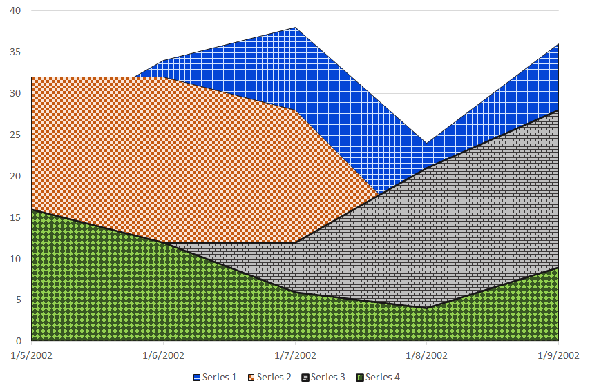
Figure 2 illustrates this technique with three bar charts shown in grayscale. Each of the charts contains three bars. The colors in the three bars are easily distinguished as separate elements when there is whitespace or a border between each bar. Without this separation, two of the bars have the same color and are hard to distinguish. It would be even more difficult to distinguish the two bars if they had the same height.
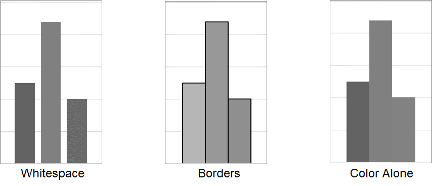
- When whitespace is added, you only need to ensure there is good contrast between each element and the background color.
- When a border is added, you need good contrast between each element and its border color, and between the border color and the background.
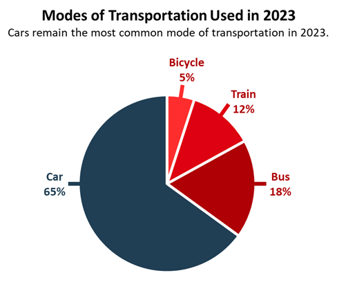
Both of these techniques are easy to achieve, even when many data elements are involved. For example, the pie chart below has four differently colored wedges separated by a small amount of white space. The three shades of red have very little contrast to each other, but all four colors have at least a 3:1 contrast ratio against the white background.
See Understanding Color, Contrast, and Single Sense for more information about color contrast.
Principle 5: Never Rely On Color Alone
Section titled “Principle 5: Never Rely On Color Alone”Even if good contrast is provided to an adjacent background or border, you still need to supply secondary information about the data to ensure all individuals can understand the data.
Secondary methods to identify data elements include:
- Adding text labels.
- Using different icons, patterns, textures, shapes, or sizes.
- Using location (similar to traffic lights) or presence/absence (such as alerts).
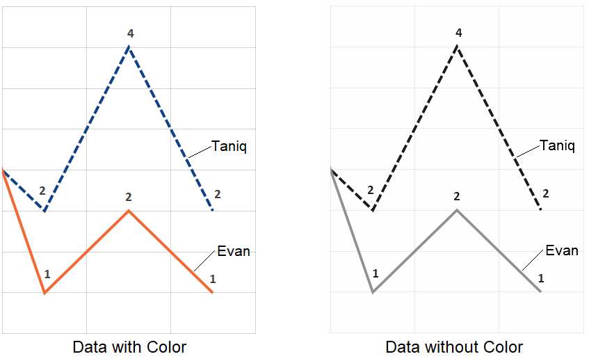
The example chart implemented these techniques in two ways:
- Direct text labels are used for the two data lines.
- Different patterns are used for the two data lines.
It is still easy to identify each data line when color is removed from the chart, as seen in Figure 4.
Be cautious when using textures and patterns. Too many textures or overly busy patterns can distract attention from the data, particularly for people who are sensory sensitive. Color works best in charts when it reinforces the information the data conveys; it should never distract from the data.
See Never Rely on Color Alone for more information about relying on color to provide information.
Color palette generators and contrast checkers can help you make good color choices for chart elements.
- Eight Shapes is one of many grid-based tools. It tests all foreground and background colors against each other for compliance with WCAG contrast requirements. This is an extremely useful way of seeing many colors at once and identifying which color combinations are accessible.
- The Adobe Color Tool generates a color palette using the color wheel as a reference. The accessibility tools check colors for compliance with the WCAG color requirements and simulate three types of color blindness. They identify color combinations where one color can be confused for another by someone who is color blind. This feature provides an insightful approach to choosing colors.
- The Leonardo Color Scales can be used to generate colors for more complex data visualizations based on a desired contrast ratio.
See Color Tools (Ta11y) for more tools.
Principle 6: Never Hide Critical Data
Section titled “Principle 6: Never Hide Critical Data”Critical data must always be accessible without user interaction. Supplemental data, if hidden, must be revealed with the keyboard focus in addition to the mouse hover.
- Always indicate the keyboard focus in addition to the mouse hover so that interactions work with both the mouse and the keyboard.
- Always tell users if there is hidden data that they can access.
- Don’t rely on the image’s title attribute to reveal data, as this is not always accessible to keyboard navigators. Always include text alternatives as explained earlier.
What qualifies as critical data? The answer depends largely on context.
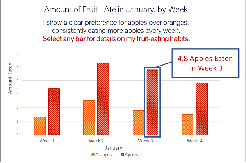
Figure 6 below is a bar chart titled “How much fruit I ate in January, by week.”
- It shows the number of apples and oranges that are eaten each week in January.
- Each week has one bar for oranges and one for apples, but the exact amount is not labeled.
- The bar for apples in week 3 has been selected, revealing that 4.8 apples were eaten in week 3.
In this example, if you’re the person buying the fruit each week, the exact number of apples and oranges eaten is critical. In this case, the values for each bar should be visible without user interaction.
If you’re not the person buying fruit, then the exact number of apples and oranges eaten each week isn’t important. In this case, the values for each bar might be hidden until the user selects an element. Notice that users are explicitly told they must select a bar to see the quantity of apples or oranges eaten each week.
Three Key Usability Principles
Section titled “Three Key Usability Principles”Usable, well-designed charts are more accessible charts. To ensure charts are usable, you must:
- Choose the right chart type for the data.
- Simplify the chart design.
- Simplify visual elements in the chart.
Principle 1: Choose the Right Chart Type
Section titled “Principle 1: Choose the Right Chart Type”Choose a chart format that makes sense based on the type of data it contains. The three most common chart types are bar, line, and pie charts.
- Bar charts show differences in the magnitude of the data.
- Line charts depict trends in the data.
- Pie charts show the distribution of data.
The recommended charts for different types of data include:
- Magnitude: Bar (simple, grouped, stacked), heat map, pictogram, line, table.
- Part-to-Whole: Pie, 100% Stacked Bar, Waffle.
- Distribution, Correlation: Scatter-Plot, Histogram, Box & Whisker.
- Time, Trends: Timeline, Gantt, Line, Simple or Grouped Bar.
- Representation: Image, Illustration, Tree Diagram, Network.
- Geography: Map (Basic, Density, Choropleth, Connection, Flow).
Choosing the wrong chart type can make the information in the chart much more difficult to understand. The example below shows how information about the number of monthly visitors to a website is easier to understand in a bar chart than in a pie chart.
- The bar chart makes it easy to understand the changes in data from month to month at a glance. Bar charts are meant to convey changes over time or to rank or compare data. Choosing this format for the changing number of visitors each month helps viewers to understand the data.
- The pie chart forces people to read each label to get the information in the data. Pie charts are meant to convey the relationship of each data section in the pie to the whole pie, not changes over time. Even after reading the labels, the relationship between the data from one month to the next is not easy to understand, as the changing sizes of the pie sections do not convey this as clearly as the bar chart.
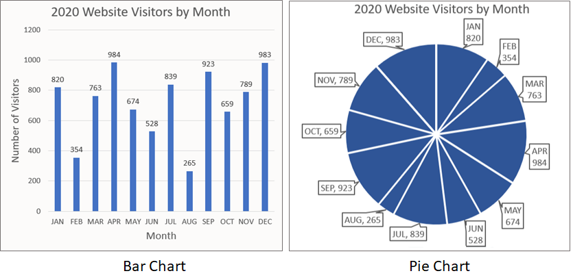
Would a line chart make sense for this data? It might, depending on what’s important about the data.
- Are you focused on the number of visitors the website gets each month? A bar chart is best for that.
- Are you trying to see when you get the most visitors? For example, does the site have more visitors during the summer? A line chart is best for seeing trends.
Principle 2: Simplify the Chart Design
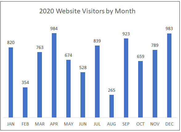
Section titled “Principle 2: Simplify the Chart Design”It’s important to simplify data presentation in charts as much as possible. Reducing the amount of information people have to process makes it easier to understand charts and graphs. That means getting rid of any unneeded information. Take the bar chart from the previous example.
- The title displays the number of monthly visitors to a website for the year 2020. This makes the horizontal axis titles “Month” and “Number of Visitors” redundant.
- Each bar is labeled with the exact number of visitors for that month, making the vertical axes’ tick marks and gridlines redundant.
The bar chart in the example below still conveys the same information as in the previous illustration, but the simplified version is easier to scan and understand. In usability terms, it places a lower cognitive load on the person processing the information in the chart.
Principle 3: Simplify Visual Elements in the Chart
Section titled “Principle 3: Simplify Visual Elements in the Chart”Reducing visual complexity makes the information in a chart stand out so that it is easier to process.
- Readability: Text should support readability for all users. See Text Size and Spacing for more information on this topic.
- Font size: Ensure fonts are large enough to be easily read. Use a 12-point font size or larger. 10-point fonts can be used for incidental information like a copyright notice.
- Font spacing: Provide adequate line and word spacing for easy readability. Aim for around 1.5 times the font size for line spacing and 0.16 times the font size for word spacing.
- Font choices: Use simple font styles (sans serif fonts), and common fonts such as Arial, Verdana, or Helvetica. Avoid using cursive scripts or unusual fonts like Old English.
- Font styles: Avoid using italics and all caps. Use bolding only for emphasis.
- Plain language: Use simple words and sentences. Avoid jargon, acronyms, and technical terms where possible. See Use Plain Language for more information on this topic.
- Simple chart designs: Use straightforward chart designs. Avoid 3-D charts, unusual perspectives, or special effects, as these can distract and make information harder to understand.
- Common chart types: Use simpler chart types when possible. Bar, line, and pie charts are already familiar to most people. Unusual chart types, such as violin plots, can be difficult to understand if people are not familiar with them.
- Meaningful color choices: Use color meaningfully to support the story conveyed by the data. For example, highlight the most important data item by using a brighter color to make it stand out. Use a color scheme that reinforces the data.
- Avoid using too many colors. The best practice is no more than 6 colors; 12 colors should be the maximum. Using more than 12 colors in a single chart can make the resulting display difficult to understand.
- Color Brewer is a tool that generates basic color palettes for categorical, diverging, and sequential chart data and includes an option to select “colorblind-safe” colors.
- For more complex chart requirements, use a tool like Leonardo, which provides a greater level of control to build an accessible color palette.
Dynamic Charts
Section titled “Dynamic Charts”Dynamic, database-driven visualizations in web applications typically use SVG images to create their charts and require additional techniques to make them accessible, particularly for people who are keyboard navigators or screen reader users.
To create dynamic visualizations that are accessible:
- Use true text instead of an image so that it is readable by assistive technologies.
- Critical data must be accessible without user interaction.
- Supplemental data must be revealed using
focusandhoverto support keyboard navigation. - Make all key elements in the chart focusable to support keyboard navigation.
- Create a logical structure when grouping elements within the SVG image.
- Maintain a logical reading order when users navigate through elements with a keyboard or assistive technologies.
- Use ARIA to provide semantic structure and accessible names for elements to support assistive technologies.
- As a secondary method of accessing information, provide accessible alternative views such as a table, CSV (Comma-Separated Values) export, outline, or in-depth text description.
- Provide a means to sort and filter data for data-dense charts so that the most relevant data can be isolated.
- If data is updated automatically or the chart includes animation, provide users with a method of stopping or controlling the update or animation. For more information on these topics, see Auto-updating Content and Motion and Animation.
One of the most common methods of turning an SVG image into an accessible chart is to use an accessible SVG table as a starting point. This method uses the SVG image <g> element (used for grouping, like a <div> in HTML) to group similar items, such as:
- a group for each axis and its constituent parts (lines, tick marks, labels);
- a group for all data elements (all lines, bars, etc.);
- a nested subgroup for each data element (each line, bar, etc.);
- a nested subgroup for each data point if it has more than one element (a dot and a label for a line chart data point).
In addition, ARIA roles and attributes must be used to provide semantic structure and accessible names for elements to support assistive technology.
Coding an accessible, dynamic chart is a complex process. This article highlights the key features that make dynamic charts accessible, but additional reading is strongly recommended. For more information on coding accessible SVG charts, see:
- Creating Accessible Line Graphs and Accessible SVG Tables. These articles from Leonie Watson describe how to code an SVG image as a table to create a simple line chart.
- Chart Accessibility Best Practices and Highcharts Demos (Accessible Charts). These articles from Highcharts include many examples that use a more complex version of the same techniques described by Leonie Watson.
- Notice that all Highcharts examples have the option to show a table view of the chart. This provides an alternative to the chart for individuals who understand tables better than charts.
Try using a screen reader to listen to any of the chart examples above to hear how accessible even a very complex chart can be.
Tactile and Audio Solutions for Chart Accessibility
Section titled “Tactile and Audio Solutions for Chart Accessibility”- Tactile (data physicalization) and audio (data sonification) solutions are two other methods of providing accessible charts and graphs. In some cases, these solutions can provide clarity to data that other types of visualizations lack.
- Tactiles and haptics are techniques that use touch to present information. Tactiles are physical objects or raised surfaces; haptics are active touch-based feedback. Devices include embossers, swell paper, vibrating touch screens, refreshable pin displays, 3D printers, and more.
- Sonification is the non-speech representation of data. A rising or falling tone might represent a line graph, or each bar in a bar chart might play a particular note on a musical scale. An electrocardiogram heart-rate monitor is an example of sonification.
For examples of tactiles, haptics, and sonification, see:
- Stanford Research 3D Display
- Tactile Infographics
- Tactile Graphics
- Sonification, The Diagram Center
- Sonification: Sounds with Meaning Activity
- Sonification of Chandra and Hubble Space Images
References
Section titled “References”- W3C WAI Tutorial Complex Images
- What is alternative text? How do I write it for images, charts, and graphs?
- Accessible Data Visualizations, The Diagram Center
- Do No Harm Guide: Centering Accessibility in Data Visualization
- Accessible SVGs, CSS Tricks
- 10 Guidelines for Accessible Data Visualizations, Highcharts
- How to write accessible descriptions for interactive charts, Highcharts
- 8 Rules for Optimal Use of Color in Data Visualization
- Color scales for data visualization in Leonardo, Nate Baldwin
- Color Palettes and Accessibility Features for Data Visualization
- 7 Tube Maps Only The Colour Blind Will Truly Appreciate
- How to Design a Heat Map That is Accessible
- How Users Change Color on Websites
- Designing UI with Color Blind Users in Mind
- Inclusive Design: Designing for the Colour-blind
- Charts and User Experience, Nielen Norman Group (3 short videos)
- Data Visualization: Design Considerations, Berkeley Library, University of California
- Visual Vocabulary: Designing with Data (Financial Times Visual Journalism Team)
- A Guide to Charts, Tableau
- How to Choose the Right Chart, Highcharts
- Choosing the Correct Chart Type, SAP Fiori Web Design Guidelines
- How to Choose the Right Chart for Your Data, Infogram
- Practical Rules for Using Color in Charts, Stephen Few, Perceptual Edge