Functional Images
Summary
Section titled “Summary”When an image acts as a link or button, it provides information to prompt an action. These images, known as functional images, require text alternatives to explain the action they initiate when clicked. The text alternative helps people who cannot see the image understand its purpose.
Overview
Section titled “Overview”Functional images enhance a link or button by visually reinforcing what happens when someone clicks on them. These functional images trigger an action instead of conveying information, but they still require a text alternative to be accessible like any other image. Unlike other images, the text alternative for a functional image must describe the image’s purpose rather than the image’s appearance.
For instance, websites often use the image of a house to link to the site’s Home page. The image visually reinforces the idea that clicking on it takes an individual to the site’s home page. The house icon’s text alternative should be “home page” rather than “house.”
There are four ways to provide text alternatives for functional images.
- Visible text (preferred)
- Visible text is the best text alternative for functional images as it ensures that everyone has the same understanding of the image’s purpose.
- Code the image and text as a single interactive element.
- Code the image as a decorative image.
- The text for the interactive element, usually a link or button, is the text alternative.
- Alternative (alt) text
- Add an
altattribute (alt text) to an image’s code with an HTML (HyperText Markup Language) attribute. - This text alternative is the next best choice if you can’t use a visible text label.
- Alt text is read by assistive technologies but seen by everyone if images are disabled.
- Do not mark these images as decorative.
- Add an
- Visually hidden text
- Add visually hidden text to an interactive element’s code with a CSS (Cascading Style Sheet) class.
- Visually hidden text is also known as “screen-reader-only text” because it is only available to assistive technologies.
- You will not see the text alternative if images are disabled.
- Code the image and its text alternative as a single interactive element.
- You may mark the image as decorative, but the interactive element must include the text alternative.
- ARIA attribute
- Add a label to the image’s code with an ARIA (Accessible Rich Internet Applications) attribute. ARIA is a set of roles and attributes used to code websites that make web content more accessible for people using assistive technology.
- You will not see the text alternative if images are disabled.
- Code the image and its text alternative as a single interactive element.
- You may mark the image as decorative, but the interactive element must include the text alternative.
Some stand-alone functional images are images of text, such as an image of the word “submit” used for a button. These images require special attention. The text alternative must always include the text in the image.
Functional images are often icons—graphical symbols representing an application, object (such as a document or web page), or function (such as the save command).
- See Writing Alternative Text (Ta11y) to learn more about writing alt text for images.
- See Images That Convey Content (Ta11y) for general information on making images accessible.
- See Images of Text (Ta11y) for specific information on handling text in images.
- See Icons (Ta11y) for specific information on working with icons.
- See ARIA Overview (Ta11y) to learn more about using ARIA.
Who is Helped
Section titled “Who is Helped”- Images that reinforce text can benefit some individuals with cognitive disabilities. Combining visual text labels with functional images makes it easier for these individuals to understand the purpose of links and buttons.
- People using screen readers benefit when functional images have text alternatives that accurately describe their purpose. Screen readers announce the alternative text for people who cannot see or understand the image.
- People who are blind rely on screen readers to understand digital content.
- People with low vision and some individuals with cognitive and learning disabilities who use assistive technology also use screen readers or similar assistive technologies.
- People who are deaf-blind can read the alternative text with a braille reader to understand the purpose of a functional image.
Guidelines
Section titled “Guidelines”Text alternatives for functional images can either be visible text next to the image or hidden text added to the image’s code. Combining functional images with visible text is best so everyone can understand the image’s function. It’s easy to misunderstand functional images without a visible label. While a well-known functional image can stand alone without accompanying visible text, combining the image with a visible label is still best. An example of a well-known image is a house that indicates a website’s Home page,
When functional images have a visible text label that describes their function, the image and text should be coded as a single element. Most links and buttons with embedded functional images are coded in this manner. In this scenario, the image should be marked as decorative since the visible text provides the text alternative.
When functional images don’t have a visible text label, you must add the text alternative to the image’s code or the interactive element containing the image. You should never treat these stand-alone functional images as decorative. When you don’t provide a text alternative for stand-alone functional images, it causes problems for people using assistive technology. This issue is especially problematic for screen reader users who cannot see the image. Screen readers will identify the image as a link or button without identifying its purpose, making it difficult to understand what action to take.
When you can’t use a visible text label to supply the text alternative for a functional image, the next best option is to use the image’s alt text. If someone turns off images or an image doesn’t load, the website will display the alt text in its place.
When you can’t use the image’s alt attribute to supply the text alternative, you must use another method, such as visually hidden text or an ARIA attribute, to describe the image’s function. When you use these methods and the image is disabled, nothing will show up in its place. For this reason, it’s always preferable to use visible or alt text instead.
There are four main guidelines to follow for functional images:
- Provide a visible text label when possible. While you can omit a visible label for well-known images, it’s best to include it.
- Combine the functional image and visible text label within a single element and mark the image as decorative.
- Stand-alone functional images must have a text alternative. When you can’t use a visible text label, supply a text alternative with alt text, visually hidden text, or an ARIA attribute.
- Functional images containing text must include the same text in their text alternative.
Provide a Visible Text Label
Section titled “Provide a Visible Text Label”Whenever possible, provide a visible text label for functional images. Combining visible text labels with functional images makes it easier for everyone to understand the image’s purpose.
- Images mean different things to different people. Most people need visible text labels to understand functional images.
- Images mean different things in different cultures. A visibly labeled functional image avoids any misunderstanding.
- Functional images with text alternatives, such as visible labels, allow people who are blind, deaf-blind, have low vision, or have cognitive disabilities to understand the image’s purpose.
- Functional images with visible labels help individuals who rely on voice control software. Without a visible label for guidance, selecting a button using a voice command is harder.
- Images that reinforce text can help some individuals with cognitive disabilities.
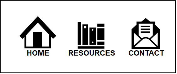
The figure below shows a navigation menu with three linked images above their corresponding text labels. The visible text labels ensure everyone understands what will happen when clicking on an image. For example, clicking the “books” image takes you to the “Resources” page. The labels provide the image’s text alternative for people using assistive technology, while the images reinforce the concept behind each link.
Functional images should not be used without a visible text label unless they meet commonly understood conventions, like the logo in the upper-left corner of a web page linking to the site’s home page or well-known icons like a magnifying glass indicating “search.” Even then, it’s best to use a visible label to ensure everyone has the same understanding of the image.
Code Images and Visible Text Labels as One Element
Section titled “Code Images and Visible Text Labels as One Element”When functional images and nearby text are linked to the same location or provide the same function, you must:
- code them as a single element and
- mark the image as decorative (
alt=””).
This approach reduces redundancy and confusion for keyboard navigators and screen reader users who would otherwise encounter the same information twice.
The following example shows the code for a home link that combines a house image with the text label “home.” It’s best to use both the image and the visible label, even though most people recognize the house symbol as representing the home page. The image in this example should be marked as decorative since the text label supplies the needed text alternative, so “alt” text is unnecessary.

Good Code Example:
<a href="home.html"> <img src="home-icon.gif" alt="" \> Home</a>Bad Code Example:
<a href="home.html"> <img src="home-icon.gif" alt="home" \></a><a href="home.html">Home</a>In the “bad” example, keyboard navigators and screen reader users will encounter the same link twice. Redundant links like this slow people down and can cause anxiety and confusion.
This example shows how the same principle works when websites use functional images as buttons. As in the previous example, it’s best to use both the image and the visible label, even though the upload symbol is widely recognized.
See Reduce Redundant Links (Ta11y) for more information.
The following examples show two ways of coding the upload button. Both provide the same result. The first example uses a .gif image inside the button and the button’s label provides the text alternative. This scenario is similar to the previous examples that combined visible text and a graphical image within a link.
Code Example:
<button onclick="..." class=”upload-style”> <img src="images/upload.gif" alt="" \> Upload</button>The second version of the upload button uses a font icon instead of a graphical image. You should treat the font icon as decorative since the button’s label supplies the needed text alternative. This example uses ARIA to identify the font icon as an image (role="img") and to hide it from assistive technologies (aria-hidden="true"). The resulting functionality is the same as the first button example, even though the code is very different.
Code Example:
<button onclick="..."> <i class="fa fa-upload" role=”img” aria-hidden=”true”></i> Upload</button>Note: Font icons are added to websites like fonts and behave similarly. You can manipulate a font icon’s size and color like text. This example shows that font icons are usually added to a web element using Cascading Style Sheets (CSS) and a CSS class. See Icons (Ta11y) for more information on using and coding font icons.
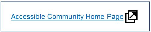
There is one exception regarding describing images within an interactive element. This case involves functional images within a link or button that convey information about the interactive element rather than its purpose. Examples include images that identify file formats or indicate that a file opens in a new window. In this situation, the text alternative for a functional image must convey the image’s meaning.
Code Example:
<a href="https://accessiblecommunity.org" target="_blank"> Accessible Community Home Page <img src="new-window.png" alt="opens in new window"></a>Don’t Treat Stand-alone Functional Images as Decorative
Section titled “Don’t Treat Stand-alone Functional Images as Decorative”Sometimes, functional images without a visible text label are necessary. You must not treat these images as decorative. To help people using assistive technologies understand the image’s purpose, the interactive element must include a text alternative that identifies the image’s purpose. You can supply the text alternative utilizing the image’s alt attribute, an ARIA attribute, or visually hidden text.
In this example, the logo on the Accessible Community website is a functional image linked to the site’s home page. As this scenario is so common, a visible text label is unnecessary. The text alternative “Accessible Community Home” tells people who rely on assistive technology that clicking on the image will take them to the site’s home page. It is unnecessary to say to people that the image is a logo or describe its appearance.
The first code example below uses the image’s alt text to provide the text alternative. A screen reader user hears, “link graphic accessible community home.”
Good Code Example:
<a href=”https://accessiblecommunity.org/”> <img src=”logo.png” alt="Accessible Community home"></a>Bad Code Example:
<a href=”https://accessiblecommunity.org/”> <img src=”homepage.png” alt=""></a>Bad Code Example:
<a href=”https://accessiblecommunity.org/”> <img src=”homepage.png” alt="Accessible Community logo is composed of a large capital letter ‘C’ with four small capital letters ‘A’s inside the ‘C’ forming the spokes of a wheel."></a>In the first “bad” example above, the text alternative fails to describe the link’s purpose because the alt text is empty. This link will confuse people relying on assistive technologies like screen readers, forcing them to guess the link’s destination.
The second “bad” example provides the text alternative but fails to describe the link’s purpose. Instead, it describes the image. People who rely on assistive technologies like screen readers will once again need to guess the link’s destination.
Refer to Writing Alternative Text (Ta11y) to learn more about writing good alt text.
You can handle buttons that rely only on an image similarly. The following example shows a “search” button composed of a magnifying glass image, a commonly used convention that does not require a visible text label. The image is a background image; it’s added to the button with CSS, and you cannot use the alt attribute with background images. Instead of using a visible label or adding alt text to the image, the ARIA attribute (aria-label=”search”) adds the text alternative to the button.

Code Example:
<button style="background:url(search.png)" aria-label="Search" ... />See ARIA Overview (Ta11y) for more information on using ARIA.
This second code example shows how to add visually hidden text to a button that uses a background image instead of having a visible label or adding alt text to the image. The CSS class “sr-only” is commonly used for this text alternative as people often refer to visually hidden text as screen reader (sr) only text.
Code Example:
<button style="background:url(search.png)" ... > <span class=”sr-only”>Search</span></button>CSS code for “sr-only” style:
.sr-only { border: 0; clip: rect(0 0 0 0); height: 1px; margin: -1px; overflow: hidden; padding: 0; position: absolute; white-space: nowrap; width: 1px;}This last case is an example of a stand-alone functional image marked as decorative with the “aria-hidden” attribute. The interactive element containing the image provides the text alternative with an “aria-label” attribute. Websites built with frameworks like React or Angular often code functional images this way.
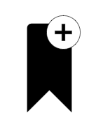
Code Example:
<button aria-controls="bookmarkButton" aria-label="bookmark this page" id="bookmarkButton"> <svg aria-hidden=”true” width="24" height="24" viewBox="0 0 24 24" fill="none"> . . . </svg></button>Text Alternatives Must Include Text in Images
Section titled “Text Alternatives Must Include Text in Images”Whenever a functional image contains text, the text alternative must include that text. This criterion is important because web content often references links or buttons. For example, a web page might tell users to “Click the Submit button when you have completed the form.” The button’s alt text is the word “Confirm.” Sighted individuals see a “Submit” button and understand what to do. However, a word substitution like this can cause problems for individuals using assistive technology.
- People using the site with a screen reader may have difficulty finding the Submit button if the button’s alt text says “Confirm.” Screen readers that supply a list of buttons will only list the Confirm button. Most screen reader users can figure out this issue, but not all alt text mismatches are this obvious. More importantly, it should be as easy for screen reader users to navigate the website as it is for all other users. They should not need to solve a puzzle to understand the meaning of a button.
- Sighted individuals who rely on voice control applications to navigate the website will tell the application to activate the Submit button, and nothing will happen. A mismatched text alternative makes it harder for voice control users to submit the form. These individuals can still navigate using a grid to get to a particular part of a page, but this is more difficult and requires many extra steps. Again, it should be as easy for voice control users to navigate the site as it is for all other users.

Code Example: Good
<input type="image" src="submit.png" alt="Submit" \>Code Example: Bad
<input type="image" src="submit.png" alt="Confirm"\>Note: The alt attribute should only be used with image “submit” buttons as it is not widely supported by browsers for other <input> types.
See Images of Text for specific information on handling text in images.
How to Test
Section titled “How to Test”Start by identifying all functional images on the page and verifying that they have a text alternative that describes their function. Decorative images embedded within a link or button should be “hidden” using alt text (alt=""), ARIA (aria-hidden=“true”), or CSS if they are background images.
Testers may need multiple checks to verify the text alternatives for all links and buttons, as more than checking images for alt text is required.
Two techniques work well to verify that functional images have an appropriate text alternative.
- Use a screen reader such as Voice Over, JAWS, or NVDA.
- Use an accessibility test tool like ANDI, WAVE, ARC Toolkit, or axe DevTools.
A screen reader is a good choice for checking functional images.
- Screen readers announce the alternative text for a functional image when navigating through a web page.
- Getting a list of links and buttons (not available on all screen readers) can quickly reveal functional images without appropriate text alternatives.
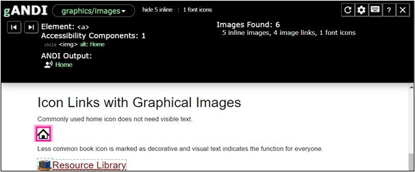
The ANDI bookmarklet does a good job of identifying images that are links and buttons and revealing their text alternative (the ANDI Output). The figure below shows a test site using the ANDI bookmarklet. In this example, ANDI identifies the image of a house as a link (part of the <a> element) and the image’s alt text as “Home.”
Code Example:
<a href="home.html"> <img src="images/home.png" alt="Home" \></a>There are two ANDI modules that you may need to use, depending on how the website coded the functional images.
- Graphics/Images: This module identifies all images added to elements with the image <img> tag and any font icons identified as images in the code.
- Focusable Elements: This module identifies all elements that can receive focus and reveals the text alternative for all focusable elements containing functional images, including all SVG and font icons. Testing this type of element with the “Focasable Elements” module provides better results than using the “Links/Buttons” module.
See ANDI (Ta11y) for more information on using this tool.
References
Section titled “References”- WCAG 2.1 Success Criterion 1.1.1 Non-text Content, Level A (W3C)
- WCAG 2.1 Success Criterion 2.4.4 Link Purpose, Level A (W3C)
- Understanding Success Criterion 2.4.4: Link Purpose In Context (W3C)
- WCAG 2.1 Success Criterion 1.3.6 Identify Purpose, Level AAA (W3C)
- Understanding Success Criterion 1.3.6 Identify Purpose (W3C)
- Tutorial: Functional Images (W3C)
- Technique H2: Combining adjacent image and text links for the same resource (W3C)
- Technique H36: Using alt attributes on images used as submit buttons (W3C)
- Technique C9: Using CSS to include decorative images (W3C)
- Hidden Content for Better A11y (Go Make Things)
Info on button examples:
Image Sources
Section titled “Image Sources”Icons from the Noun Project, no attribution required.
- Dog Image by Anna https://pixabay.com/users/anna-f-4839342/?amp;utm_medium=referral&utm_campaign=image&utm_content=5173354 from Pixabay (free use, no attribution required)