Visually Distinct Links
Summary
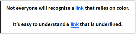
Section titled “Summary”It should be easy for a sighted person to tell the difference between a clickable link and static text. The majority of documents and websites underline links. People are used to seeing links underlined so that they stand out visually from the surrounding static text. People may not understand or notice a clickable link when this convention is not followed.
Overview
Section titled “Overview”A usability maxim known as Jakob’s Law (coined by usability expert Jakob Nielsen) states, “Users spend most of their time on other sites. This means that users prefer your site to work the same way as all the other sites they already know.”
When something repeatedly looks or behaves the same way, we come to expect it always to be that way. When making a website or document, it’s helpful to use design patterns that people are familiar with. This makes it easier for people to understand and reduces their cognitive load.
Links are a good example of this concept. The vast majority of documents and websites underline links to make them stand out from the surrounding text. Most people will transfer that expectation to your documents and websites. People are forced to learn a new pattern when links are not underlined. This increases the cognitive load for everyone and can be overwhelming for people with certain cognitive and learning disabilities. Even people with mild cognitive impairments can have difficulty recognizing and remembering new patterns.
When a method other than underlining is used to make links stand out from surrounding text, it is important to make the links obvious and easy to find. When color is used to make links stand out, the links can be distinguished by people who are colorblind or have low or limited vision. This is done by meeting a minimum change in levels of contrast (luminosity) from the surrounding text and by requiring an additional non-color-based indicator when the link is hovered.
Who is Helped
Section titled “Who is Helped”People who are color blind cannot always discern links from the surrounding text if color is the only indicator used to identify the links. They will not understand content that relies solely on color to convey information. Underlined links are the best way to support people who are colorblind.
People with low or limited vision need links that are visually distinct from other text. When links use color to stand out from the surrounding text, specific color contrast requirements must be met. Without this visual cue, links can be hard to find and can be overlooked. These individuals also benefit from having an extra indicator other than color when links receive focus.
People with certain cognitive disabilities can find new design patterns confusing. For some people, learning new patterns can create a cognitive load that is overwhelming and they may be unable to find information or complete tasks. These individuals may not realize text is a link if the text is not underlined. Even people with mild cognitive impairments may not recognize or remember links if they are not underlined.
Guidelines
Section titled “Guidelines”Basic Guidelines for All Links
Section titled “Basic Guidelines for All Links”The Web Content Accessibility Guidelines (WCAG) state that color should not be used as “the only visual means of conveying information, indicating an action, prompting a response, or distinguishing a visual element.” This results in some specific requirements for links.
-
All links must be visually distinct from the adjacent static text.
-
Underlining links is the best way to ensure links are visually distinct from the adjacent static text. The WCAG guidelines call out underlining as “the preferred technique to differentiate link text,” as this is the expected design pattern used for links.
-
It is a best practice to avoid underlining text that is not a link. When you want to emphasize other words, make them bold instead.
-
When links are not co-located with static text, this guideline generally does not apply.
-
For example, links that are located in elements like menus, navigation bars, or tab panels usually do not need to meet this guideline as they usually do not include static text. It is clear that the text in these elements are links based on their context.
-
The guidelines for visually distinct links do apply when menus combine links and static text, such as in a large dropdown menu. It must be easy to distinguish the links from any other text.
-
-
When a technique other than underlining is used to make links stand out from static text, it must be applied to links in a way that is unique. For example, if links are bolded to make them stand out, then bolding should not be used for anything other than to indicate a link.
Guidelines for Links that are Distinguished by Color
Section titled “Guidelines for Links that are Distinguished by Color”Links that use a change of color to stand out must meet specific contrast criteria. WCAG guidelines state that visible content should Never Rely on Color Alone to convey meaning. When colors have a significant change in contrast (brightness) as well as a change in hue, the change in contrast counts as a second indicator in addition to the change in color.
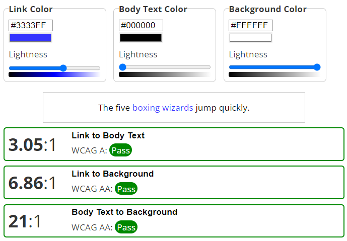
- Link text color must have a 3 to 1 contrast ratio from the adjacent static text.
- Link text color must have a 4.5 to 1 contrast ratio from the background color.
- Static text color must have a 4.5 to 1 contrast ratio from the background color.
- A second indicator other than color (hue) or contrast must be added when the link is hovered.
- A second indicator other than color (hue) or contrast is needed because it is impossible to meet the other criteria for using color to make links distinct and have a 3:1 contrast between the original and hovered link colors.
- The second indicator can be an underline, a change in style such as bold or italics, or any similar technique.
This guideline does not apply to links in menus or other situations where the context indicates the text is a link. However, these links still need a Visible Focus. It is best practice to use different indicators for the mouse hover and keyboard focus indicators. Focus Indicator Contrast covers the contrast requirements for keyboard focus.
Learn more about contrast requirements in Text Contrast and Non-text Contrast. These requirements help people with low vision or color blindness differentiate colors based on contrast (brightness).
Meeting the color-based requirements for visually distinct links can be tricky. To be successful, the static text and page background colors must be black and white or very close to black and white. Even with that restriction, only a limited range of colors is available for the link text that meets all 3 color criteria.
- WCAG Technique G183 provides working examples to support the success criteria governing the use of color (Success Criteria 1.4.1) with 26 safe link colors that will pass these criteria when paired with black text and a white background.
It is common for links to change colors when they are active or visited, in addition to when they are hovered. When color alone is used to identify links, the colors for all link states must meet the criteria for sufficient contrast. The 26 safe link colors in the WCAG working examples can also be used for alternate link states.
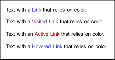
This is one example of link colors that meet all contrast criteria when used with black text on a white page:
- Link: blue (#3344dd)
- Visited link: purple (#884488)
- Active link: red ( #bb1122)
- Hovered link: blue (#3344dd) (adds underlining for the second indicator)
Creating links that are visually distinguishable can be complicated. The article, “Well Color Us Surprised—This SC Can Be a Tricky Customer,” has several good - and surprising - examples illustrating this guideline.
How to Test
Section titled “How to Test”Remember that these guidelines do not apply to links in menus or other elements where the links are not mixed with static text, and it is clear from the context that they are links.
Start with a visual inspection of the page.
- Are all links visually distinct from the adjacent static text? If not, this is a failure.
- If yes, are these links underlined? If yes, the links are good.
- If not, do links have a visual style that makes them stand out from surrounding text other than a difference in color? If yes, the links are good.
- If not, do links rely only on color to be visually distinct from the surrounding text?
- Use a color contrast checker to verify all colors have the correct color contrast ratios. The WebAIM Link Contrast Checker is recommended as it checks all 3 colors in one test.
- Verify that when these links are hovered, there is an additional indicator that does not rely on color. For example, you can use an underline or a change in the font style.
- See Color-related Test Tools (Ta11y) for other testing options.
References
Section titled “References”- WCAG 2.1 Success Criteria 1.4.1 Use of Color, Level A (W3C)
- Understanding WCAG SC 1.4.1 Use of Color (Level A)
- Technique G183: Using a contrast ratio of 3:1 with surrounding text and providing additional visual cues on hover for links or controls where color alone is used to identify them
- WebAIM: WCAG 2.0 and Link Colors
- WebAIM: Link Contrast Checker
- 26 safe link colors: Links with a 3:1 contrast ratio with surrounding text
- Well Color Us Surprised—This SC Can Be a Tricky Customer
- Jakob’s Law of Internet User Experience