Focus Not Obscured
Summary
Section titled “Summary”The focus indicator is a valuable visual cue for sighted keyboard navigators. It tells them what element they are interacting with. You must not hide interactive elements receiving focus under other components. For example, a sticky footer can hide the current focus if content scrolls under the footer. Focused elements that are obscured may prevent people from knowing where they are on a page and what they must do to complete a task. The focused element must remain visible as people navigate a page’s content.
Overview
Section titled “Overview”Users must see where the focus is to successfully navigate a website using a keyboard or any other alternative input device. People can easily see the mouse pointer on the screen, but not everyone uses a pointer device like a mouse. For sighted keyboard navigators, a focus indicator highlights the element receiving focus to indicate where they are on the page. This indicator is moved by pressing the Tab key and emphasizes each interactive element in turn, using an outline, shadow, underline, or contrasting color. However, it can cause problems if another component covers the focused element, preventing people from seeing it. What are these components? Most commonly, components that can obscure focused elements are sticky headers and footers, non-modal dialogs, and floating notifications. These can frustrate people, who may refuse—or not know how—to proceed.
Who is Helped
Section titled “Who is Helped”Having a visible focused element helps mainly sighted users who cannot use a mouse for one reason or another.
- Persons who have to use—or prefer using—a keyboard will benefit from seeing the focused component because it helps them avoid getting lost while browsing a webpage.
- People with limited vision who use a screen magnifier, which significantly restricts their viewport. Thus, a clearly visible, focused element is helpful for them, too.
- Sighted individuals with physical disabilities who rely on the keyboard and other non-pointing devices, like mouth sticks, sip-and-puff software, speech input, and other assistive technologies.
- People with particular cognitive challenges, such as attention deficit, short-term memory, executive function limitations, or anyone who may be distracted, should know where the focus is. Knowing where the focus is helps them return to where they were on the page.
Guidelines
Section titled “Guidelines”This topic’s guidelines are about keeping the focused element visible and identifying elements that may obscure it. To learn more about focus indicators in general, see Visible Focus.
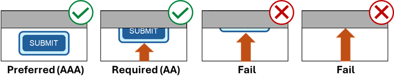
The Web Content Accessibility Guidelines (WCAG) require you to keep focused elements visible. Two guidelines (success criteria) with two conformance levels apply to this issue. The difference between these two success criteria is in how much of the focused element must be visible.
- Success Criteria 2.4.11 defines the minimum requirement (level AA) that the focused element be at least partially visible. In other words, another component can hide part of the focused element, but we should still see the remaining part.
- When the focus indicator is external to the focused element, it does not count as part of the element for this check.
- Ask yourself: Do I still recognize which element has focus even when it’s partially obscured?
- Success Criteria 2.4.12 defines the enhanced criterion (level AAA) as that the focused element should be fully visible. Although not required, this guideline is a best practice. You should always aim to keep the focused element fully visible.
User-Controlled Content
Section titled “User-Controlled Content”User-controlled content presents unique circumstances when testing to see if the focused element is hidden. These circumstances apply to both user-movable and user-opened content.
User-movable content consists of components that users open themselves and can reposition. Examples include dialog boxes, windows, and tool panels.
- If users can move appeared content, like non-modal dialogs or tool panels, they can overlap focused components on the page after being moved.
- You only need to test the original position of movable content.
User-opened content consists of components that users open themselves and can close with the Escape key or by completing an action. Examples include menu lists, select lists, date pickers, and tooltips.
- You only need to test user-opened content if it is persistent. A component is persistent if it remains open after the user completes the action (e.g., selects a date from the calendar) or moves away from the triggering element (i.e., the button that opened the menu).
- If users open a component, like a chatbot or slide-out menu, it can cover up a focused element. But if users can dismiss the opened component without moving the focus, then the focused element isn’t considered obscured. For example, if users can close a slide-out menu by pressing the Escape key, the menu will not affect their ability to see focused elements.
How to Keep Focused Elements Visible
Section titled “How to Keep Focused Elements Visible”Sticky headers and footers, non-modal dialogs, and floating notifications are the most common elements that can cover up or overlap the item receiving focus. You can use the following techniques to keep the focused element visible when someone is tabbing through the page and engaging with interactive components.
- Avoid using sticky components if possible. This option is the best way to meet both success criteria. Despite some advantages, you must carefully code every interactive element to make a fully accessible webpage with a fixed component.
- If you use a sticky component in your website, make it not sticky for smaller viewport sizes. Even well-designed websites can fail as the viewport becomes smaller. For example, on a mobile phone screen, a sticky component can cover too much of the screen compared to how much it would cover a desktop or laptop screen. Even on a desktop, sticky components can cover almost the entire screen at high magnification levels.
- Shift existing content when user-opened content appears, accordion-style.
- Constrain the focus inside a dialog. If a dialog box appears on the web page, make sure users close this element before returning to the web page, i.e., make this element modal. How does it help? When a modal dialog opens, the focus goes to the dialog, and other content on the page is inactive until the user dismisses this window.
- Slide-out menus can also obscure focused elements. To help with that, content on the page could be reflown or moved so that the focused element stays visible when a person opens the menu. Alternatively, you could use the same approach as the previous technique, keeping the focus within the open menu until it’s closed. For more information about accessible slide-out navigation, see the article “Let’s Focus on Slide-Out Navigation” by Knowbility.
- Another effective technique is to add scroll-padding to interactive elements. You can use Cascading Style Sheets (CSS) to add this attribute to focusable elements in the webpage’s code. Scroll padding adds space around these elements and can keep them visible when they come in contact with a component that might hide them. More information about this technique is available in “Using CSS scroll-padding to unobscure content” and “Scroll Snapport: The ‘scroll-padding’ property” by the W3C.
- Often, a page has wide margins where websites can open chatbots or other author-created components so nothing overlaps the content. The following figure from USA.gov’s Chat page exemplifies this technique.
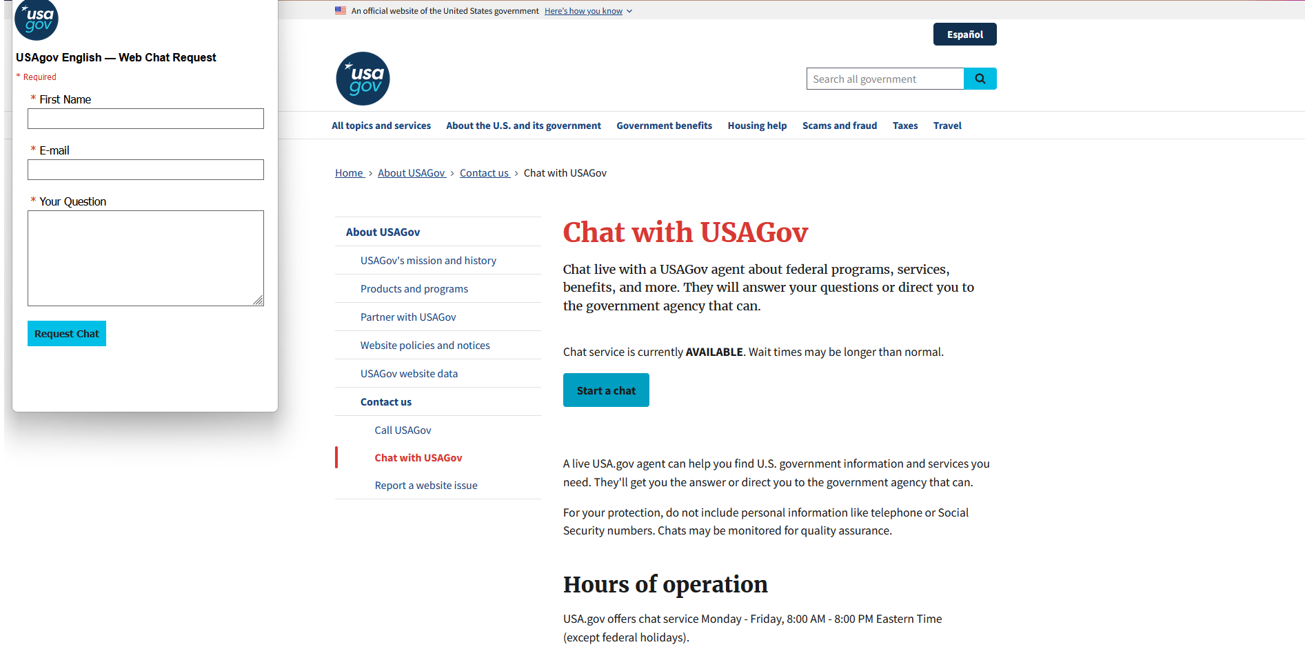
Figure 2: Chatbot Opened in a Wide Margin
A good source of information on how to code sticky headers to keep your focused elements visible, including different approaches and code snippets, is the article “Prevent focused elements from being obscured by sticky headers,” published by TPGi (previously known as The Paciello Group).
Note: a correctly coded modal window will always pass the success criteria for “Focus Not Obscured.”
How to determine a well-programmed modal window:
- When activated, the focus goes to the element in this newly opened window.
- Focus stays inside the modal window while the person makes his decision.
- The person who opened this window can always close it. You must not trap the user in the modal window without a way to return to the webpage. See Keyboard Traps for more information.
How to Test
Section titled “How to Test”Manual Testing
Section titled “Manual Testing”The testing process is relatively straightforward:
- Start from the top of the page and tab through all interactive elements on the page using only the keyboard.
- When you reach the bottom of the page, use Shift+Tab and return to the top of the testing page.
- If you notice any sticky components, tab past them and then back up. Pay close attention to the focus indicator; you must see all focused items.
Sometimes obscuring components could be semi-transparent, but this doesn’t necessarily cause a failure of SC 2.4.11 Focus Not Obscured (Minimum) right away until tested against SC 1.4.11 Non-text Contrast. If the color contrast isn’t sufficient to easily see the focused element under the semi-transparent layer, then the focused element is considered hidden. See Non-text Contrast for more information on color contrast requirements.
Pay close attention to the focus indicator, especially when passing through sticky content. Sometimes, you must tab back and forth to be sure your focus behavior is as expected. The example below shows how the focus indicator can become hidden by the sticky header.
Examples
Section titled “Examples”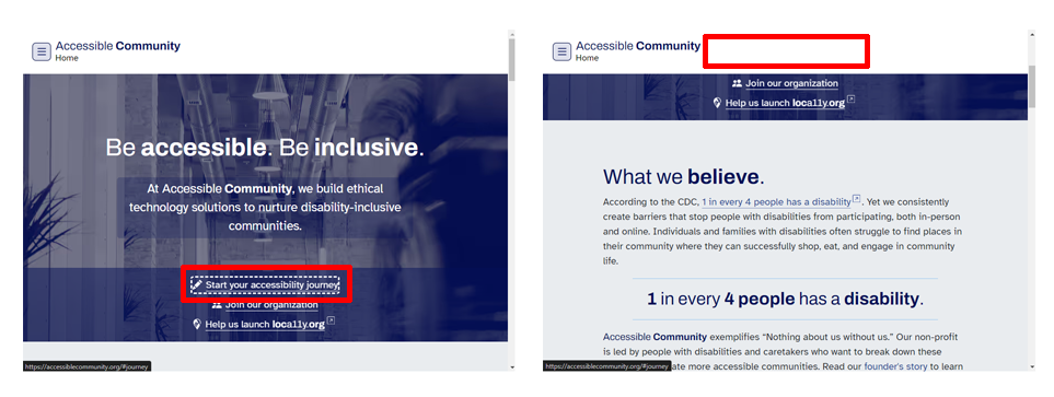
The Accessible Community page shown in Figure 3 has a sticky header, which always stays on top of the page even when users tab further down. What may happen if a user wants to navigate backward and return to the top? In a good scenario, the user can do this without any problem. But in this instance, focus indicators become hidden behind this sticky header. When users do not see which element is focused, they may be confused and perhaps even think their computer froze. That’s why elements with a keyboard focus must always be visible.
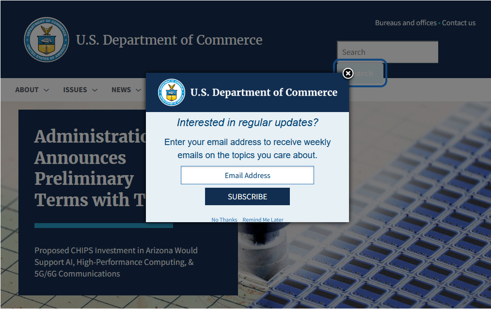
The example of a U.S. Department of Commerce webpage in Figure 4 shows a dialog box that covers part of a focus indicator and the site navigation menu on the web page beneath it. The dialog box does not constrain the focus indicator. It allows it to move beyond the dialog, which fails both success criteria, as users cannot see which elements are in focus when they are behind this dialog, such as the items in the site menu.
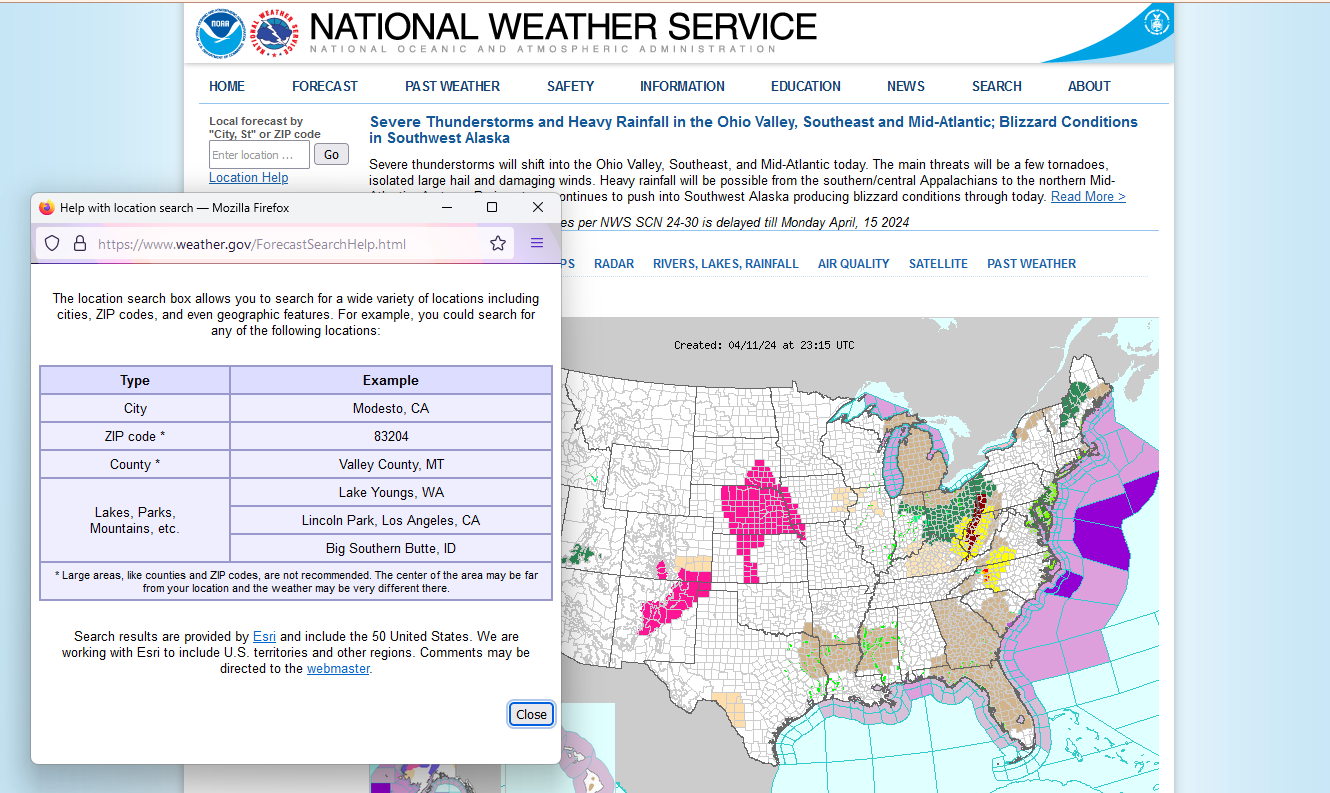
The example in Figure 5 shows a National Weather Service webpage. When a user activates the “Location Help” link, it opens a new browser window. Users can move this window anywhere over the page if they want to go back and navigate in the original window before closing this new one. If the user doesn’t intentionally return to the original window, the focus remains inside this new window until the user closes it. This example passes both success criteria.
Automated Testing
Section titled “Automated Testing”There is currently no automated test for these new WCAG 2.2 success criteria, but this functionality should eventually be available. For more details, check the article “How to test 2.4.11: Focus Not Obscured (Minimum)” by TPGi.
References
Section titled “References”- WCAG Success Criteria 2.4.11 Focus Not Obscured (Minimum), Level AA (W3C)
- WCAG Success Criteria 2.4.12 Focus Not Obscured (Enhanced), Level AAA (W3C)
- Understanding S.C. 2.4.11 Focus Not Obscured (Minimum) (W3C)
- Understanding S.C. 2.4.12 Focus Not Obscured (Enhanced) (W3C)
- A guide to designing accessible focus indicators (Sara Soueidan)
- Prevent focused elements from being obscured by sticky headers (TPGi)
- How to test 2.4.11 Focus Not Obscured (TPGi)
- Focus Appearance and Focus Not Obscured video(Knowbility)
- Focus Appearance and Focus Not Obscured slides (Knowbility)
- Let’s Focus on Slide-Out Navigation (Knowbility)