Introduction to Exterior and Interior Signs
Summary
Section titled “Summary”Signs are an important part of figuring out how to navigate or find something in a space. Some signs may need specific features, like Braille or pictograms. You may need different types of signs depending on:
- the purpose of the space
- things to do in the space
- expectations of people in the space.
Overview
Section titled “Overview”Signs provide guidance to help sighted people and those with complete or partial loss of sight identify, navigate, and utilize physical spaces. People with disabilities rely on signs to learn about and find accessible features. Consistent layouts, simple fonts, raised letters, braille, and easy-to-understand signs in all permanent public facilities and office buildings make social spaces easier for everyone.
All people require quick access to information in times of emergency. So features like exits, entrances, restrooms, and refuge areas must be clearly marked with easily understood information. Sometimes, a picture, simple instructions, or extra lighting can make the difference.
Take a look at an exit sign with accessible features.
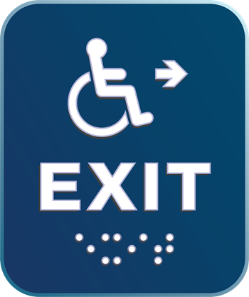
The most commonly recognized feature of an accessible sign is the raised dots of the braille alphabet for people who are blind, located at the bottom of the sign. However, it is not enough just to include braille on signs, as not all people who are blind can read braille. Signs like the one shown include raised letters and a raised pictograph - a picture representing words. These features help blind individuals who can’t read braille. Pictographs also help people with cognitive and learning disabilities who may have difficulty reading or people who speak another language.
Other design features make a sign easier to locate and understand. Accessible signs use bold text in a simple font with good contrast to support people with low or limited vision and people who are colorblind. Signs must be made of non-glare materials and placed consistently. Exit signs, for example, need to be placed at specific locations along accessible exit paths and at levels that make them easy to find and read.
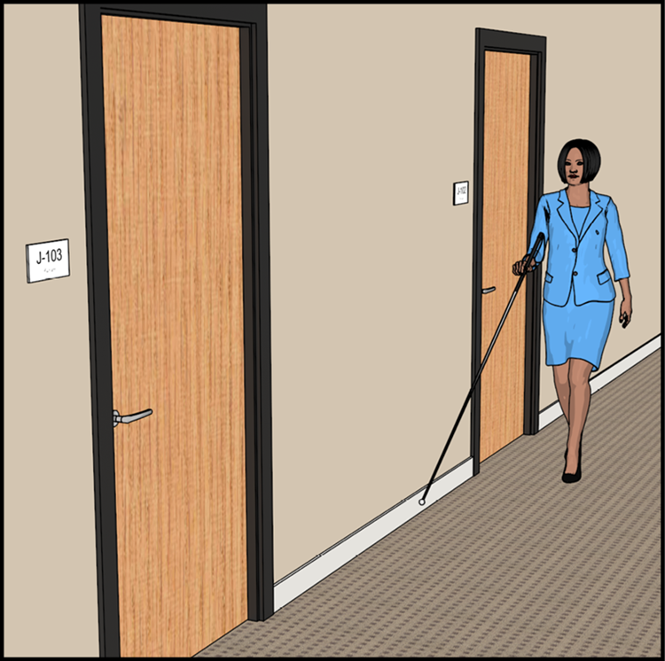
The person in the figure below, from the U.S. ADA Accessibility Standards, is using a white cane, an assistive device used by people with complete or partial loss of sight. As illustrated, all room signs have the same design. They are placed near eye height and in the same location in relation to the doorway. This consistency means that people can use doorways as clues to locate the signs. Braille and raised characters on the signs identify the correct room.
All of these considerations go into making a sign accessible. However, only some signs require all of these features. For example, exit signs located above doors or that hang from the ceiling do not need braille but are often lit to make them easier to see. In these cases, an exit sign in another location may be required to meet accessibility requirements. The design, content, location, and number of duplicate signs needed depend on the sign’s intended purpose.
Not all signs need to be accessible. Accessible room signs are required when a room is open to the public or employees, permanent, and the room name or number does not change. Informational signs that are temporary, private, or stylized, like company names and logos, may not need accessible features. However, organizations should always include an accessible option wherever possible.
For information on individual specifications or regional regulations, see Laws and Standards for Interior and Exterior Signs.
Who is Helped
Section titled “Who is Helped”- It is easier for people with partial or complete vision loss to read and comprehend low-glare signs with high contrast, simple fonts, and large, well-proportioned text.
- Blind people and people with low vision rely on consistently designed signs with braille and raised characters placed at locations that are easy to find and read so that they can find their way.
- People with disabilities who require physical accommodations use signs to find accessible features like ramps, handicapped bathrooms, assistive listening devices, etc.
- Good signage helps everyone be safe, especially in times of distress or emergency.