Link Accessibility
Links are an important element in all digital content. Links allow people to navigate between one web page, document, or file and another. People should be able to find links easily and understand where they go. Creating links that are descriptive, unique, and stand out from the surrounding text helps everyone to navigate content and complete tasks involving links easily.
Overview
Section titled “Overview”Accessible links, or hyperlinks, provide a key functionality in websites and documents and, for that reason, are a critical component of accessibility. They connect a web page or document to another location or file. Text, images, icons, and other elements can all be links.
It is important that links work for everyone. Links can present challenges for some groups of people with disabilities if they are not built with accessibility in mind:
- People who are blind.
- People who have limited or low vision.
- People with cognitive and learning disabilities.
- People with limited or no manual dexterity.
- People who are color blind.
To meet the needs of these diverse groups of people it is important to ensure that links are visually distinguishable, link text is descriptive, and redundant links are avoided. In other words, links need to be easy to find, easy to understand, and unique. These basic guidelines make links easier to use, prevent confusion, and decrease the cognitive load for everyone. Links are not something people should have to stop and think about - using a link should be effortless.
Who is Helped
Section titled “Who is Helped”People Who are Blind or Have Limited or Low Vision
Section titled “People Who are Blind or Have Limited or Low Vision”These individuals typically rely on assistive technologies such as screen readers to access online information. They can use the screen reader to generate a list of links and quickly access any link on a page. They can also access links by tabbing from one link to another as the screen reader announces each link.
Screenshot showing the list of links generated by an NVDA screen reader for the Accessible Community Home Page. See text for full description.
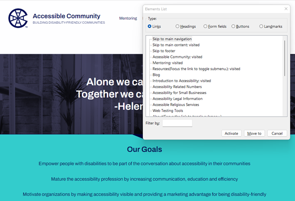
Figure 1 shows the list of links generated by an NVDA screen reader for the Accessible Community Home Page. The list includes links like “Skip to main navigation,” “Mentoring,” and “Blog.” Even taken out of context, these links make sense - it’s easy to understand what will happen if any of these links is selected.
- Screen reader users rely on descriptive text to determine the meaning of links. Since these users often navigate by getting a list of links it is important for links to make sense when taken out of context.
- Having many links on a page that go to the same destination can be confusing. This is especially true when adjacent links go to the same destination or when links with different link text go to the same destination.
- People with limited or low vision also need links that are visually distinct from other text. Without this visual cue, links can be hard to find and may be missed completely.
People with Cognitive and Learning Disabilities
Section titled “People with Cognitive and Learning Disabilities”Links that are ambiguous, redundant, or hard to identify can increase the cognitive load for people with cognitive and learning disabilities.
- Vague or ambiguous links may be hard to understand. People with cognitive disabilities and learning limitations rely on descriptive text to provide meaning to links.
- Every link encountered increases the number of decisions a person has to make. Redundant links cause the purpose of links to become unclear, distract a user’s attention, and cause confusion. This reduces the ability of individuals to navigate or interact with content successfully. Moreover, people may fail to recognize that they have already selected a link which can increase their confusion.
- Links that are not visually distinct from adjacent static text are hard to find and may be missed completely.
People With Limited or No Manual Dexterity
Section titled “People With Limited or No Manual Dexterity”For people with physical disabilities that prevent them from using a mouse, redundant links increase the number of keystrokes required to tab to all the links on a page. These extra keystrokes may slow them down, cause discomfort, and make it difficult to navigate a site.
People Who are Color Blind
Section titled “People Who are Color Blind”These individuals cannot always distinguish links from the surrounding text when color is the only indicator used to identify links. Underlined links are the best way to support people who are color blind.
Visually Distinct Links
Section titled “Visually Distinct Links”It should be easy for a sighted person to tell the difference between a clickable link and static text. The majority of documents and websites underline links. People are used to seeing links underlined so that they stand out visually from the surrounding static text. When this convention is not followed, people may not understand or notice a clickable link.
A usability maxim known as Jakob’s Law (coined by usability expert Jakob Nielsen) states, “Users spend most of their time on other sites. This means that users prefer your site to work the same way as all the other sites they already know.”
When something repeatedly looks or behaves the same way, we come to expect it always to be that way. When making a website or document, it’s helpful to use design patterns that people are familiar with. This makes it easier for people to understand and reduces their cognitive load.
Links are a good example of this concept. The vast majority of documents and websites underline links to make them stand out from the surrounding text. Most people will transfer that expectation to your documents and websites. People are forced to learn a new pattern when links are not underlined. This increases the cognitive load for everyone and can be overwhelming for people with certain cognitive and learning disabilities. Even people with mild cognitive impairments can have difficulty recognizing and remembering new patterns.
When a method other than underlining is used to make links stand out from surrounding text, it is important to make the links obvious and easy to find. When color is used to make links stand out, the links can be distinguished by people who are colorblind or have low or limited vision. This is done by meeting a minimum change in levels of contrast (luminosity) from the surrounding text and by requiring an additional non-color-based indicator when the link receives focus.
Link Text
Section titled “Link Text”Ask yourself, if the only thing that I saw was a link’s text, would I know what will happen when I click it? Screen reader users often generate a list of links when listening to a web page so they can quickly navigate to the desired link. People with cognitive and learning disabilities may have a difficult time understanding a “click here” link that relies on the previous paragraph to explain its purpose. Issues like these mean that the text of a link must describe the link’s destination in a way that is easy to understand, even when taken out of context.
Links are everywhere; present in email, social media, documents, and websites. Links, or hyperlinks, allow users to navigate from one location to another. Accessible hyperlinks are one of the key aspects of creating accessible websites and documents. Creating links that are easy to understand is important in enhancing usability and accessibility for everyone.
It does not take much to make a link’s text accessible.
- Ensure that the link text clearly describes the link’s destination.
- Ensure that the link text is concise, descriptive, and retains its meaning when taken out of context.
- Ensure that the link text does not use ambiguous phrases such as “click here” or “read more.”
- Ensure that the link text used to describe a specific destination is unique.
- Don’t use different words to link to the same destination.
- Don’t use the same words to link to different destinations.
- Ensure that the link text is not a URL.
- Ensure that the link text is 100 characters or less whenever possible.
- Ensure that the link text is not left empty.
Redundant Links
Section titled “Redundant Links”Redundant links occur when two or more links that appear next to each other lead to the same destination. This commonly happens when an icon or an image that acts as a link appears next to a text link. Redundant links can be confusing, often causing people to go to the same destination twice, and making navigation difficult for keyboard navigators and people using assistive technology.
One of the more common accessibility issues with links is the presence of redundant links. Redundant links are defined as adjacent links that lead to the same location or page destination. For instance, a store website might separately link an image of a product and the adjacent text about the product to the same product page.
Redundant links may visually appear to be a single link, but keyboard navigators and assistive technology users encounter them as separate links. Eliminating redundant links is vital to ensuring accessibility for keyboard navigators and people using assistive technology so that they are able to easily navigate and interact with a site.
Examples of redundant links:
- Adjacent text links that lead to the same destination.
- Adjacent image and text links that lead to the same destination
Adjacent links should be combined into a single link whenever possible. If one of the links is an image, the text and image links should be combined into a single link and the image should usually be treated as decorative.
People can also be confused by having the same link repeated multiple times on a web page even when the links are not adjacent. Sometimes it’s not clear to users why they are hearing the same link again. Links should only be repeated when doing so enhances the user’s understanding of the content or functionality of the web page.