Content Organization
Summary
Section titled “Summary”Well-structured content plays a crucial role in accessibility. Following these guidelines makes content easier for everyone to scan and understand.
- Organize content logically so that it makes sense.
- Chunk and group content so that it is easy to understand.
- Use headings, lists, and tables to help readers “scan” the document.
- Make the most important information easy to find.
Overview
Section titled “Overview”Most people do not look at a page and read it word-by-word. Instead, they quickly look at the entire page and try to pick out headings, sentences, or keywords to get the information they want. This process is known as “scanning.”
Having logical, organized, predictable, and scannable content improves usability and accessibility. The content’s structure helps people find and understand needed information on a page. Descriptive headings with a logical hierarchy and blocks of information with clear relationships help to organize content in ways that are easy to scan and understand.
Jakob Nielsen, a leader in user design, has said, “Content creators need to accept this fact: People are not likely to read your content completely or linearly. They just want to pick out the information that is most pertinent to their current needs.”
How can you ensure your content is easy to scan?
- Break information into chunks that reinforce structure and define relationships.
- Organize content in a logical hierarchy to help people make sense of the information.
- Use descriptive headings to help people find and focus on needed content.
- Use headings, lists, and tables to break up text and make it easier to scan.
- Put important content first to make it easy to find.
- Highlight important text to direct the reader’s attention to key content.
All these elements combine to create structured, organized content that is easy to scan and understand.
For more information about scanning, see Jakob Nielsen’s article, “How Users Read on the Web.”
Who is Helped
Section titled “Who is Helped”People with cognitive and learning disabilities may not understand the content, use applications, or complete tasks when the page structure and relationships are unclear.
-
Many people with cognitive and learning disabilities related to processing language benefit from a clear content structure. This structure helps people locate and focus on the information they need.
-
A clear content structure also helps people who are easily distracted or have difficulties remembering information. When content has a clear structure, it is easier to parse information, use applications, or complete tasks.
-
Dividing content into logical blocks or “chunks” of text helps people with learning or cognitive disabilities related to processing speed, language, memory loss, or distractibility. Chunking content makes it easier to read and understand.
Visual content cues may not help people who are blind, but other aspects of good content structure and organization impact them.
-
People who are blind rely on headings, lists, and tables to structure and streamline content. Using descriptive headings with a clear content hierarchy helps them orient themselves on a page and find the needed content.
-
People relying on screen readers or other text-to-speech technologies always appreciate more concise content, which means less noise to listen to.
-
Clear, descriptive content makes it easier to find needed information.
Design Principles
Section titled “Design Principles”A good content structure that supports scanning helps everyone quickly find the information they need so they can focus on the task at hand.
In his research on how people read web pages, Mr. Nielsen found that:
- 79 percent of test users always scanned any new page they came across;
- only 16 percent read word-by-word.
Six Key Principles
Section titled “Six Key Principles”Six key organizational principles help people quickly scan and understand content:
- Divide content into chunks.
- Place chunks into logical sections with a logical order.
- Support “scannability” with headings, lists, and tables.
- Be concise.
- Highlight key phrases to direct attention.
- Use visual and page structures to reinforce the content structure.
Principle 1: Divide Content into Chunks
Section titled “Principle 1: Divide Content into Chunks”Pages containing text-dense content can overwhelm some readers. It makes content hard to scan, and finding needed information can be time-consuming. Chunking text makes it easy to scan and understand.
- Break large text areas into smaller chunks.
- Use headings to organize the chunked content.
- Keep paragraphs and sentences short.
- Use lists and tables when appropriate.
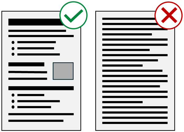
The simple depiction of two web pages in Figure 1 shows the difference between structured content and a wall of text. Even without actual text, you can see the impact of headings, lists, and distinct sections of content on the page’s scannability. The reader’s gaze naturally moves from one chunk to the next, stopping briefly to scan each heading, and then moving on until the needed content is found.
Read “Chunking” from UX Planet for more examples of chunking text.
| Use: Chunked Content | Avoid: Walls of Text |
|---|---|
| In this example, each sentence is concise, makes a single point, and is easy to scan. Pages containing text-dense content can overwhelm some readers. It makes content hard to scan, and finding needed information can be time-consuming. Chunking text makes it easy to scan and understand. Break large text areas into smaller chunks. Use headings to organize the chunked content. Keep paragraphs and sentences short. Use lists and tables when appropriate. Read “Chunking” from UX Planet for more examples of chunking text. | In this example, you must read through the entire paragraph to understand the point of each sentence, and scanning is difficult. Pages containing text-dense content can overwhelm some readers and prevent scanning. Finding needed information when reading one paragraph of text after another can be time-consuming. Chunking text makes content easier to scan and understand. To start, you should break large areas of text into smaller blocks or “chunks” of text. You should then use headings to organize the chunked content. It is best to keep paragraphs and sentences short, and use lists and tables instead of paragraphs when appropriate. This article on “Chunking” from UX Planet has many examples of how to chunk text. |
Principle 2: Create Logical Sections with a Logical Order
Section titled “Principle 2: Create Logical Sections with a Logical Order”Create a logical flow from one section of content to the next. A logical of information helps people make sense of the relationships between sections of content.
- Arrange related content chunks into sections.
- Put the purpose (heading) at the beginning of each section.
- Put information in a logical order, for example:
- By order of importance, sequence, date, or other logical framework.
- Create a logical flow from one concept to the next, for example:
- From simple to complex.
- From the big picture to supporting details.
- Provide a summary for long articles or documents.
This article is an example of logically organized content.
- The single level 1 heading, Content Organization, identifies the page’s purpose.
- Under the main heading are five subordinate level 2 headings with clearly identified purposes: Summary, Overview, Who is Helped, Design Principles, and References.
- These five sections have a logical flow as they build from simpler to more complex information, with supporting reference material placed last.
- The largest section, Design Principles, is chunked into seven smaller sections.
- A level three heading identifies the purpose of each of these sections.
- The sections have a logical flow as they move from one concept to the next, concluding with an example summarizing the previous sections.
You can learn more from Headings.
Principle 3: Support Scannability
Section titled “Principle 3: Support Scannability”Headings, lists, and tables lower text density on a page and make content easier to scan.
- Use the main heading to identify the page’s purpose.
- Use descriptive headings to identify the purpose of each section of content.
- Use lists when you have a series of three or more similar things.
- Use tables to illustrate logical relationships between data.
Scannibility helps people determine:
- what content is on a page,
- what tasks they can accomplish,
- where they can find the information they’re looking for, and
- how to return to that information if they are distracted.
This article illustrates the use of headings, lists, and tables to identify content sections and break up large text areas. Without them, this article would be an endless wall of text. It would be more difficult to read and impossible to scan.
See Understanding Page Structure to learn how headings, lists, and tables can reinforce page structure.
Principle 4: Be Concise
Section titled “Principle 4: Be Concise”You should always be as concise as possible while ensuring the meaning of the content is clear. Overly long and complex content takes more effort to understand. It decreases scannability, increases cognitive load, and slows readers down.
- Limit page content to one topic.
- Stay under three levels deep for headings or lists.
- Aim for half the word count of conventional writing.
- Use short sentences and paragraphs.
- Choose simpler words and phrases over more complex ones.
- Avoid the use of jargon and marketing language.
| Use: Concise, Clear Text | Avoid: Long, Convoluted Text |
|---|---|
| Complex words and phrases can be confusing. Keep words and sentences as short as possible while keeping the meaning clear. | Labyrinthine terminology and verbiage can obfuscate the intent of an assertion. It is essential when writing to maintain a measure of brevity for all words, sentences, and paragraphs while simultaneously ensuring that the sum and substance of all the information retains its comprehensibility. |
Principle 5: Highlight Key Phrases to Direct Attention
Section titled “Principle 5: Highlight Key Phrases to Direct Attention”Use style and color changes sparingly to help important content stand out from the surrounding text. Making large amounts of text bold and brightly colored defeats the purpose of emphasizing key content. If everything is important, then nothing is important. If you bold several paragraphs, then nothing in that text stands out from the rest.
- Use bold text or color changes to bring attention to key phrases.
- Avoid applying stylistic emphasis to large blocks of text.
- Reserve italics for parenthetical information, like citations of laws.
Many people with dyslexia have trouble reading large blocks of bold or italic text.
| Use: Highlight Key Phrases Only | Avoid: Highlighting Blocks of Text |
|---|---|
| Use style and color changes sparingly to highlight only the most important text. Highlighting large blocks of text lessens the emphasized text’s impact and makes it harder to understand what is important. | Use style and color changes sparingly to highlight only the most important text. Highlighting large blocks of text lessens the impact of the emphasized text and makes it harder to understand what is important. |
Important: One more crucial criterion for this design principle is never relying only on visual changes alone to convey meaning, especially when content is critical. Not everyone can see that the text is bold or red. Ensure the text conveys any important information in addition to the stylistic changes.
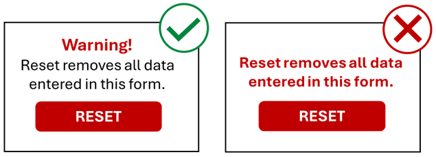
Figure 2 shows two examples of a reset button with warning text above the button.
- The first example includes the phrase “Warning!” in bold red text, followed by the explanation that “Reset removes all data entered in this form.”
- The second example has bold red text that says, “Reset removes all data entered in this form,” but does not include the key “Warning!” phrase.
- People who cannot see the style and color change in the second example may not immediately realize the danger of using the reset button.
Principle 6: Reinforce the Content Structure
Section titled “Principle 6: Reinforce the Content Structure”Content structure, visual structure, and page structure are the three legs of the structure tripod. There is a close connection between the content’s structure and its visual organization and underlying page structure.
-
Do not rely on the content structure alone to define hierarchy or relationships.
-
Use the visual organization to support and reinforce the content’s organization.
-
Both the visual and content organization should reflect the underlying page structure.
Content, design, and development teams must coordinate all three structural aspects from the beginning of a design.
-
See Understanding Page Structure for information on creating the page structures that support your content.
-
See Visual Organization to learn more about how visual cues reinforce the content structure.
Example of Good Structure
Section titled “Example of Good Structure”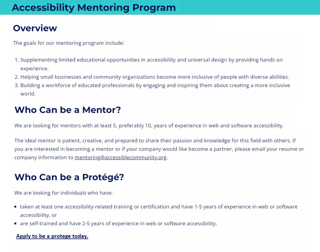
Figure 3 uses the Accessible Community Mentoring page to illustrate the concepts of good structure.
- The main heading - Accessibility Mentoring Program - conveys the page’s purpose.
- The main heading is a level 1 heading.
- It is the top level of the heading structure.
- The page’s content is limited to the mentoring program.
- The content is only two levels deep.
- The content has three logical sections, each with its heading:
- Overview, Who can be a Mentor, and Who can be a Protégé.
- The headings describe the purpose of each section.
- These are level 2 headings, subordinate to the main page heading.
- The sections are in a logical order.
- The most important information is at the top of the page.
- Lists increase the scannability of the content.
- “Apply to be a protégé today” at the bottom of the page is bold to emphasize its importance.
- The text conveys needed information without being overly wordy, using jargon, or “marketing” the mentoring program.
- Adequate white space separates each section of content, reinforcing the structure provided by the headings and increasing the page’s scannability.
References
Section titled “References”- WCAG 2.1, Success Criterion 1.3.1 Info and Relationships, Level A (W3C)
- WCAG 2.1, Success Criterion 2.4.10 Section Headings, Level AAA (W3C)
- Making Content Usable for People with Cognitive and Learning Disabilities - Objective 2: Help Users Find What They Need (W3C)
- Making Content Usable for People with Cognitive and Learning Disabilities - Objective 3: Use Clear and Understandable Content (W3C)
- Plain Language Guidelines (U.S. Government)
- Australian Government Style Manual - How People Read
- How Users Read on the Web (Jakob Nielsen, Nielsen Norman Group)
- An underrated writing skill: chunking (Cynthia Marinakos, UX Planet)
- How Chunking Helps Content Processing (Kate Moran, Nielsen Norman Group)